Onboardings in Augmented Reality: offering ARwesome app experiences
Munich, 14th September 2021. When you try an Augmented Reality (AR) smartphone app for the first time, there are usually some challenges on how to use it. The reason: AR is a new mental model that needs to be trained as first-time users are not yet used to a real world interaction via smartphone. To see it from the creators perspective: building a straight-forward user onboarding in Augmented Reality (AR) is a tricky task — for UX designers, Product Managers and Engineers. The onboarding decides whether the customer will adopt the technology and its features. However, we learned over time how it can be improved. Hence, we want to share our insights how to make your AR app more user friendly and charming.
Let’s go back to the year 2018: kick-off of our iOS Augmented Reality (AR) team. We had already a small solution in place. It was a classic, ARKit-based 3D product preview which allowed customers to see our products live in their space. Basically, the “standard solution” for a company on the Home & Living market.
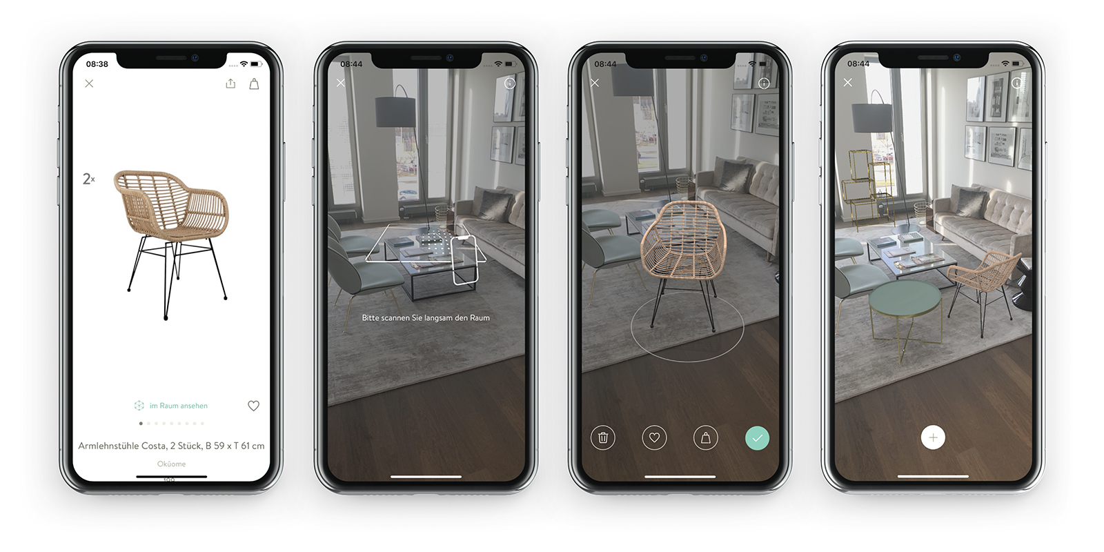
From a technical perspective: The user had to discover a horizontal plane* and place the 3D furniture on it — via finger tap.
*Simplified explanation of a ”plane”: a plane is a horizontal or vertical surface on which the 3D object will be anchored once detected. Nowadays, the handheld’s technology is mainly based on camera-view-based visual odometry, which requires the user to scan the room with the device’s rear-camera. In our case, this means pointing the device towards the floor and moving the smartphone/tablet. The movement is essential as it simplifies the detection of so-called “feature points” (if the environmental conditions — like the light in the room — are sufficient). The feature points enable calculation of the customer’s position and a proper understanding of the real space. And at the end, it enables the placement of the virtual item in the real world.
In 2018, we had about twenty customer-facing 3D models live. Besides the model creation, the onboarding UI was a challenge:
We explained to the user via a text message to “scan slowly the respective room”. That’s it. Just text, no image. Looking back: much room for improvement. For a first-time AR user it was difficult to understand what needed to be done so that the feature can be used.
From UX perspective, AR still needs to be considered as a new technology. Even though its origins go back at least to 1968, where Ivan Sutherland invented the so-called “Sword of Damocles” that is widely considered to be the first AR head-mounted display. But we are talking about a democratic AR experience which became globally available on smartphones and tablets few years ago. For a lot of eCommerce customers it’s still uncharted territory. Such a text hint could — especially in 2018 — only be understood by tech-savvy or gaming-loving people.
Honestly speaking, we — in the Tech department — only understood that the wording and our general 2D-onboarding was ambiguous once we started analyzing the user flow based on analytics data.
Looking at the numbers, we did not only find out that some users were not able to discover a plane and place the product on it, but we were even driving them away. A large majority of users who failed placing the virtual item haven’t returned to the feature.
So besides optimizing our 3D model quality, we first needed to put an emphasis on one (if not the most) important phase of an AR journey: the onboarding. After the camera permission, it’s the pre-requirement which decides whether a customer will be able to use your AR feature or not:
Without proper guidance, no plane detection. Without a plane, no object anchoring. Without object anchoring, no AR experience…
The following chapters intend to give a small insight into what we have learned about optimizing our AR onboarding journey over time.
1. Learn from your customers We had set that metric as a gauge to understand how many first-time users manage to place the 3D furniture in their room. We called it the (3D) Item Placement Success Rate.
Our goal: hitting 80%! At the beginning, only around 50% of our first-time users managed to place the object. Given those numbers, we needed to learn about how our customers were using our AR feature.
Hence, we invited some of them to our Munich headquarter and started 2019 a usability research lab. At this time, we’ve already added to our text-only instruction “please scan slowly the room” an animation illustrating how to scan.
 The scanning animation
Last but not least, we made the detected feature points visible in the field-of-view — as kind of a positive reinforcement (in a sense: if you see those dots, you are on the right track… keep going!). So, actually we thought that we were well prepared. We weren’t — but our customers helped to make a change.
What we have learned: Most of the research participants saw the onboarding but didn’t interact with the real world. They simply waited and watched the animation playing. However, the actual “scanning process” starts after moving the device.
 Our onboarding (from left to right) after first iterations. Overall: a very charming implementation but still not very user-friendly.
Main insight: most first-time AR users don’t move their device pro-actively. Our research participants thought that the room scanning would work automatically — by simply pointing the device in the right direction of the space.
Outcome: today, we show an instruction message to move the device if a customer doesn’t do it proactively. On the other hand: if a customers moves the device, the message won’t appear. Furthermore, we’ve amended the wording to a more descriptive “point your device towards the floor and move it to the left and the right”. “Scanning” is not straight-forward. Words are a lever. Which brings us to the second insight.
2. Take UX writing serious
Our AR feature is opened via the respective product detail page of the desired item (see screenshot above). “View in AR”, “view in your room”, “place it in your space”: we’ve considered and tried out many CTA button wordings to describe our feature.
However, those texts were not comprehensible. We noticed this once our customers gave us wrong descriptions of the feature that they would expect behind the button. For instance, one customer thought that it would be possible to see the selected furniture on different pictures of living rooms.
Hence, we asked our customers — right after trying out the AR feature — how they would call it. Most of them said that they would name it “Virtual Reality” (VR).
Even though VR describes a different technology, the unknown experience was associated with it. Thus, we started to find a compromise solution: we didn’t want to use the technically incorrect terminology. But we wanted to convey what could be found behind the CTA. Rationale: customers might bounce within seconds if they expect a different functionality behind the button.
Main insight: Ask customers how they would call your AR experience without priming them. They will lead you to a reasonable naming that will help to make a difference.
Outcome: After some back and forth, we’ve figured out that “view virtually in your room” gives a proper impression of what our feature offers. It was a good compromise between Virtual (Reality) and a description of the functionality. We see less users bounce after opening the AR scene — since they get what they’ve expected.
3. Use real-time onboarding wherever appropriate
Plane detection and stable object anchoring depend on many factors — at least if the visual odometry approach is chosen.
A few examples: • if it is too dark in the room, there is a lack of contrast and image information. Feature points cannot be identified. In other words: the customer won’t make it to place the object. • The same applies to surfaces that do not have a clear structure (such as a white wall). • Another special case: if the user is in a moving vehicle, the accelerometer can go crazy. Try it out on your own: even if you make it to place the object during your ride in a train, it will likely fly away.
 At one point we started to summarize different obstacles that a customer might face during scanning to derive action points
Of course, it stands to reason that all these pitfalls can be avoided by explaining everything in detail to users via a tutorial. The challenge is that no one likes tutorials that have to be read in advance (especially since some customers might already be experienced in using AR). Hence, we didn’t show the tutorial before the AR experience but integrated a non-intrusive help button on the real-world-view that could be used if needed.
However, the button achieved a low click-through rate (CTR). Even after we’ve made it more eye-catching by adding an animation to it… which started playing if a customer didn’t find a plane within 10 seconds.
 One of our tutorial approaches
Besides the CTR that didn’t meet our expectations, our numbers indicated that the tutorial didn’t lead to the expected results. Even after opening it, only few readers wanted to complete the onboarding afterwards. The tutorial was too long and time-costly.
But it’s understandable: you want to browse, shop and not go through a “read-me”-tutorial during your buying experience. This approach might work for mobile games — but it doesn’t for our user journey.
Main insight: Classic tutorials did not help to increase our Item Placement Success Rate. An AR onboarding in the field of eCommerce needs to be as short as possible so that it doesn’t break the buying/browsing experience.
Outcome: While classic tutorials are time-costly and negatively impact the shopping experience, real-time feedback is entertaining and doesn’t steal time. After a trade-off (code complexity versus benefit), we’ve decided to remove the full-screen tutorial and kept only our real-time feedback tooltips. Example: we show an instruction message (“please turn on the light ”) if we receive the tracking state of insufficient light conditions.
 Example of a real-time instruction: if we don’t detect a sufficient number of feature points, we ask to try it at a different place in the room.
Did we reach our goal? You’re probably wondering if we’ve reached the 80% Item Placement Success Rate. The simple answer: yes — we hit the threshold. The value fluctuates between 75–83% depending on the week and seasonality.
Is it worth adopting the above-mentioned for your own AR onboarding? Some of the mentioned insights will definitely help to improve current AR experiences. Though, the technology evolves. We are currently in a transition phase from visual odometry to new approaches. Apple offers an outstanding out-of-the-box onboarding for zero development effort and enhanced technologies like LiDAR will become more relevant in near future. So, it’s just a matter of time until every customer will easily detect a plane with the first try. Nevertheless, it’s still worth experimenting. Simply adopt some of the insights for your own implementation and see what the numbers tell.
About Westwing Westwing is the European leader in inspiration-based Home and Living eCommerce with EUR 433m of revenue in 2020. Through its ‘shoppable magazine’, Westwing inspires its loyal Home Enthusiast customers with a curated product selection and combines that with gorgeous content. With unparalleled loyalty, Westwing is generating more than 79% of orders from repeat customers. Westwing’s mission is: To inspire and make every home a beautiful home. The company was founded in 2011 and is headquartered in Munich. Westwing went public on the Frankfurt Stock Exchange in October 2018 and is active in eleven European countries.